The Big Picture: War, Energy, Bonds and Gold

Two inter-connected themes likely to dominate the next few decades are War and Energy.

War may take the form of a geopolitical struggle between opposing ideologies, with conventional wars limited to proxies in most cases and nuclear exchanges avoided because the costs are prohibitive. But it is likely to involve fierce competition for energy and resources in an attempt to undermine opposing economies. The impact is likely to be felt throughout the global economy and across all asset classes, including bonds, stocks and precious metals.

War

War can take many forms: conventional war, nuclear war, proxy war, cold war,  economic war, or some combination of the above.

Nuclear war can hopefully be avoided, with sane leaders skirting mutually assured destruction (MAD). For that reason, even conventional war between great powers is unlikely — but there is a risk of it being triggered by escalation in a war between proxies.

Cold war, with limited trade between opposing powers — as in the days of Churchill’s Iron Curtain — is also unlikely. Global economic interdependence is far higher than sixty years ago.

Greg Hayes, chief executive of Raytheon, said the company had “several thousand suppliers in China and decoupling . . . is impossible”. “We can de-risk but not decouple,” Hayes told the Financial Times in an interview, adding that he believed this to be the case “for everybody”.

“Think about the $500bn of trade that goes from China to the US every year. More than 95 per cent of rare earth materials or metals come from, or are processed in, China. There is no alternative,” said Hayes. “If we had to pull out of China, it would take us many, many years to re-establish that capability either domestically or in other friendly countries.”

What is likely is a struggle for geopolitical advantage between opposing alliances, with economic war, proxy wars, and attempts to build spheres of influence. This includes enticing (or coercing) non-aligned nations such as India to join one of the sides.

Such a geopolitical arm-wrestle is likely to have ramifications in many different spheres, but most of all energy.

Energy

You can’t fight a war without energy. A key element of the geopolitical tussle will be to secure adequate supplies of energy — and to deprive the opposing side of the same.

The situation is further complicated by the attempted transition from fossil fuels to low-carbon energy sources.

Since the Industrial revolution, development of the global economy has been fueled by energy from fossil fuels, with GDP and fossil fuel consumption growing exponentially. Gradual transition to alternative energy sources would be a big ask. To attempt a rapid transition while in the midst of geopolitical conflict could end in disaster.

Global Energy Sources

The challenge is further complicated by attempts to replace fossil fuels with wind and solar which generate intermittent power. Base-load power — generated from fossil fuels or nuclear — is essential for many industries. Microsoft are investigating the use of nuclear to power data centers. The US Department of Defense (DoD) has commissioned Oklo Inc. to design and build a nuclear micro-reactor to power Eielson Air Force Base in Alaska. Renewables are a poor option for critical applications.

Russia’s 2022 invasion of Ukraine highlighted Germany’s energy vulnerability despite billions of Euros invested in renewables over recent decades. You cannot run a modern industrialized economy without reliable energy sources.

Low investment in fossil fuel resources — which fail to meet ESG standards — has further increased global vulnerability to energy shortages during the transition.

Inflation

War and pandemics cause high inflation. Governments run large deficits during times of crisis, funded by central bank purchases in the absence of other investors. This causes rapid expansion of the money supply, leading to high inflation.

Geopolitical conflict and the attempt to rapidly transition to carbon-free fuels — while neglecting existing resources — are both likely to cause a steep rise in energy costs.

Energy Prices

Bond Market

The bond market has the final say. The recent steep rise in long-term Treasury yields is the bond market’s assessment of fiscal management in the US. The deeply divided House of Representatives has effectively been awarded an “F” on its economic report card.

10-Year Treasury Yield

Failure of a divided government to address fiscal debt at precarious levels and rein in ballooning deficits raises a question mark over future stability, with the bond market demanding a premium on long-term issues.

The rating downgrade of the United States reflects the expected fiscal deterioration over the next three years, a high and growing general government debt burden, and the erosion of governance relative to ‘AA’ and ‘AAA’ rated peers over the last two decades that has manifested in repeated debt limit standoffs and last-minute resolutions. (Fitch Ratings)

CBO projections show federal debt held by the public rising from 98% of GDP today to 181% in thirty years time.

CBO Debt Projections

Rising long-term yields also add to deficits as servicing costs on existing debt increase over time. The actual curve is likely to be even steeper. CBO projections assume an average interest rate of 2.5%, while current rates are close to 5.0%.

Yield Curve

Continuing large fiscal deficits in the next few decades appear unavoidable. The result is likely to be massive central bank purchases of fiscal debt — as in previous wars/pandemics — with negative real interest rates (red circles below) driving higher inflation (blue) and rising inequality.

Moody's Aaa Corporate Bond Yield & CPI

Political instability

Interest rate suppression effectively subsidizes borrowers at the expense of savers. Only the wealthy are able to leverage their large balance sheets, buying real assets while borrowing at negative real interest rates. Those less fortunate have limited access to credit and suffer the worst consequences of inflation, further accentuating the division in society and fostering political instability as populism soars.

Commodities

Resources are likely to be in short supply, from under-investment during the pandemic, geopolitical competition, and the attempted rapid transition to new energy sources. Prices are still likely to fall if global demand shrinks during a recession. But growing demand, shrinking supply (from past under-investment) and inflation pushing up production costs are expected to lead to a long-term secular up-trend.

Copper

Gold

High inflation, negative real interest rates and geopolitical competition are likely to weaken the Dollar, strengthening demand for Gold as a safe haven and inflation hedge. Breakout above $2000 per ounce would offer a long-term target of $3000.

Spot Gold

Conclusion

We expect large government deficits and shortages of energy and critical materials — such as Lithium and Copper — the result of a geopolitical struggle and attempt to transition to low-carbon energy sources over several decades.

Rising government debt will necessitate central bank purchases as the bond market drives up yields in the absence of foreign buyers. The likely result will be high inflation and interest rate suppression as central banks and government attempt to manage soaring debt levels and servicing costs.

Our strategy is to be overweight commodities, especially critical materials required for the transition to low-carbon fuel sources; short-term bonds and term deposits; and defensive (value) stocks.

We are also overweight energy, including: heavy electrical; nuclear technology; uranium; and oil & gas resources.

Gold is more complicated. Rising long-term interest rates will weaken demand for Gold, while geopolitical turmoil will strengthen demand, causing a see-sawing market with high volatility. If long-term yields fall — due to central bank purchases of US Treasuries — expect high inflation. That would be a signal to load up on Gold.

We are underweight growth stocks and real estate. Rising long-term interest rates are expected to lower earnings multiples, causing falling prices. Collapsing long-term yields due to central bank purchases of USTs, however, would cause negative real interest rates. A signal to overweight real assets such as growth stocks and real estate.

Long-term bonds are plunging in value as long-term yields rise, with iShares 20+ Year Treasury ETF (TLT) having lost almost 50% since early 2020.

iShares 20+ Year Treasury ETF

The trend is expected to reverse when Treasury yields peak but timing the reversal is going to be difficult.

Acknowledgements

Hard or Soft Landing?

Almost every recession in history has been preceded by speculation that the economy is in for a “soft landing.” After the early warning signs, nothing much happens. The stock market keeps climbing despite rising interest rates, raising hopes of a “lucky escape”.

The four most expensive words in the English language are: “This time it’s different.” ~ Sir John Templeton

The economy takes time to adjust to changed circumstances and there can be a lag of two years or more between the first rate hikes and the inevitable rise in unemployment. Plenty of time for self-delusion as stocks keep rising and unemployment stays low.

The difference between a hard and soft landing is best measured by unemployment. At 3.5%, the March reading shows no sign yet of an approaching recession.

Unemployment

The lag between an inverted yield curve — caused by Fed rate hikes — and unemployment can vary quite widely between recessions, depending on other influences. The chart below shows how an inverted yield curve in July 2000 was followed by the first sign of rising unemployment in January 2001, and shortly afterwards by a recession in March. The next yield curve inversion started in February 2006, the first sign of rising unemployment in July 2007, and the recession only in December of that year. Red bars below represent the lag between yield curve inversion and the first sign of rising unemployment.

Treasury Yields: 10-Year minus 3-Month & Unemployment

The current yield curve inversion (10-Year minus 3-Month Treasury yield) started in November 2022, so the earliest we are likely to see a rise in unemployment is late-2023.

Treasury Yields: 10-Year minus 3-Month

Why is unemployment expected to rise?

Every yield curve inversion (10-Year minus 3-Month above) since 1960 has been followed by the NBER declaring a recession within two years.

Every time the Conference Board Leading Economic Index declined below the red line at -5.0% has signaled recession.

Conference Board Leading Economic Index

Why do we expect a hard landing?

Every economy runs on credit and the US is no different. The severity of a recession is determined by the extent of the contraction in credit growth, as shown by the red circles below. Note how late the contraction generally is, often occurring after the official recession (gray bar) has ended.

Bank Credit

What determines the size of the credit contraction?

Firstly, bank net interest margins.

Banks tend to borrow short-term and lend long, enhancing their net interest margins in good times. But an inverted yield curve pulls the rug from under them, with short-term rates spiking upwards.

The more that net interest margins of commercial banks are squeezed, the more they avoid risk, restricting lending to only their best clients.

The percentage of domestic banks tightening lending standards on C&I loans climbed to 44.8% in March 2023.

Commercial Bank: Tightening Credit Standards for Commercial & Industrial Loans

Second, is the level of uncertainty facing banks.

The S&P 1500 Regional Banks index plunged after the collapse of Silicon Valley Bank (SVB), Silvergate Bank and Signature Bank.

Bank Credit

Shocks in the financial system tend to occur in waves. Latest is the threatened collapse of First Republic Bank (FRC) which has lost almost 100% of value in the past few months**.

First Republic Bank (FRC)

The CSBS Community Bank Index of Business Conditions is lower than at the height of the pandemic.

CSBS Community Bank Sentiment

Third is liquidity.

A strong surge in money market assets, warns that money (+/- $450 bn) has flowed out of the banking system and into the relative safety of money market funds.

Money Market Fund Assets

Money market funds are primarily invested in Fed reverse repo and Agency and Treasury securities, bypassing the banking system.

Money Market Fund Investment Allocation

Conclusion

Bank net interest margins are being squeezed, uncertainty is rising following the Silicon Valley Bank collapse, liquidity is being squeezed, and banks are tightening lending margins. The only party who can prevent a severe credit crunch is the Fed. By reversing course and injecting liquidity (QE) into financial markets, the Fed could attempt to create a soft landing for the economy.

But the Fed is bent on taming inflation and restoring their lost credibility after their earlier “transitory” error. The cavalry is likely to arrive late and low on ammunition.

We expect a hard landing.

Latest News**

Reuters: First Republic Bank (FRC)

Acknowledgements

EPB Research for the Conference Board LEI chart.

Economic Outlook, March 2023

Here is a summary of Colin Twiggs’ presentation to investors at Beech Capital on March 30, 2023. The outlook covers seven themes:

  1. Elevated risk
  2. Bank contagion
  3. Underlying causes of instability
  4. Interest rates & inflation
  5. The impact on stocks
  6. Flight to safety
  7. Australian perspective

1. Elevated Risk

We focus on three key indicators that warn of elevated risk in financial markets:

Inverted Yield Curve

The chart below plots the difference between 10-year Treasury yields and 3-month T-Bills. The line is mostly positive as 10-year investments are normally expected to pay a higher rate of investment than 3-month bills. Whenever the spread inverted, however, in the last sixty years — normally due to the Fed tightening monetary policy — the NBER has declared a recession within 12 to 18 months1.

Treasury Yields: 10-Year minus 3-Month

The current value of -1.25% is the strongest inversion in more than forty years — since 1981. This squeezes bank net interest margins and is likely to cause a credit contraction as banks avoid risk wherever possible.

Stock Market Volatility

We find the VIX (CBOE Short-term Implied Volatility on the S&P 500) an unreliable measure of stock market risk and developed our own measure of volatility. Whenever 21-day Twiggs Volatility forms troughs above 1.0% (red arrows below) on the S&P 500, that signals elevated risk.

S&P 500 & Twiggs Volatility (21-Day)

The only time that we have previously seen repeated troughs above 1.0% was in the lead-up to the global financial crisis in 2007-2008.

S&P 500 & Twiggs Volatility (21-Day)

Bond Market Volatility

The bond market has a far better track record of anticipating recessions than the stock market. The MOVE index below measures short-term volatility in the Treasury market. Readings above 150 indicate instability and in the past have coincided with crises like the collapse of Long Term Capital Management (LTCM) in 1998, Enron in 2001, Bear Stearns and Lehman in 2008, and the 2020 pandemic. In the past week, the MOVE exceeded 180, its highest reading since the 2008-2009 financial crisis.

MOVE Index

2. Bank Contagion

Regional banks in the US had to be rescued by the Fed after a run on Silicon Valley Bank. Depositors attempted to withdraw $129 billion — more than 80% of the bank’s deposits — in the space of two days. There are no longer queues of customers outside a bank, waiting for hours to withdraw their deposits. Nowadays online transfers are a lot faster and can bring down a bank in a single day.

The S&P Composite 1500 Regional Banks Index ($XPBC) plunged to 90 and continues to test support at that level.

S&P Composite 1500 Regional Banks Index ($XPBC)

Bank borrowings from the Fed and FHLB spiked to $475 billion in a week.

Bank Deposits & Borrowings

Financial markets are likely to remain unsettled for months to come.

European Banks

European banks are not immune to the contagion, with a large number of banking stocks falling dramatically.

European Banks

Credit Suisse (CS) was the obvious dead-man-walking, after reporting a loss of CHF 7.3 billion in February 2023, but Deutsche Bank (DB) and others also have a checkered history.

Credit Suisse (CS) & Deutsche Bank (DB)

3. Underlying Causes of Instability

The root cause of financial instability is cheap debt. Whenever central banks suppress interest rates below the rate of inflation, the resulting negative real interest rates fuel financial instability.

The chart below plots the Fed funds rate adjusted for inflation (using the Fed’s preferred measure of core PCE), with negative real interest rates highlighted in red.

Fed Funds Rate minus Core PCE Inflation

Unproductive Investment

Negative real interest rates cause misallocation of capital into unproductive investments — intended to profit from inflation rather than generate income streams. The best example of an unproductive investment is gold: it may rise in value due to inflation but generates no income. The same is true of art and other collectibles which generate no income and may in fact incur costs to insure or protect them.

Residential real estate is also widely used as a hedge against inflation. While it may generate some income in the form of net rents, the returns are normally negligible when compared to capital appreciation.

Productive investments, by contrast, normally generate both profits and wages which contribute to GDP. If an investor builds a new plant or buys capital equipment, GDP is enhanced not only by the profits made but also by the wages of everyone employed to operate the plant/equipment. Capital investment also has a multiplier effect. Supplies required to operate the plant, or transport required to distribute the output, are both likely to generate further investment and jobs in other parts of the supply chain.

Cheap debt allows unproductive investment to crowd out productive investment, causing GDP growth to slow. These periods of low growth and high inflation are commonly referred to as stagflation.

Debt-to-GDP

The chart below shows the impact of unproductive investment, with private sector debt growing at a faster rate than GDP (income), almost doubling since 1980. This should be a stable relationship (i.e. a horizontal line) with GDP growing as fast as, if not faster than, debt.

Private Sector Debt/GDP

Even more concerning is federal debt. There are two flat sections in the above chart — from 1990 to 2000 and from 2010 to 2020 — when the relationship between private debt and income stabilized after a major recession. That is when government debt spiked upwards.

Federal & State Government Debt/GDP

When the private sector stops borrowing, the government steps in — borrowing and spending in their place — to create a soft landing. Some call this stimulus but we consider it a disaster when unproductive spending drives up the ratio of government debt relative to GDP.

Research by Carmen Reinhart and Ken Rogoff (This Time is Different, 2008) suggests that states where sovereign debt exceeds 100% of GDP (1.0 on the above chart) almost inevitably default. A study by Cristina Checherita and Philip Rother at the ECB posited an even lower sustainable level, of 70% to 80%, above which highly-indebted economies would run into difficulties.

Rising Inflation

Inflationary pressures grow when government deficits are funded from sources outside the private sector. There is no increase in overall spending if the private sector defers spending in order to invest in government bonds. But the situation changes if government deficits are funded by the central bank or external sources.

The chart below shows how the Fed’s balance sheet has expanded over the past two decades, reaching $8.6 trillion at the end of 2022, most of which is invested in Treasuries or mortgage-backed securities (MBS).

Fed Total Assets

Foreign investment in Treasuries also ballooned to $7.3 trillion.

Fed Total Assets

That is just the tip of the iceberg. The US has transformed from the world’s largest creditor (after WWII) to the world’s largest debtor, with a net international investment position of -$16.7 trillion.

Net International Investment Position (NIIP)

4. Interest Rates & Inflation

To keep inflation under control, central bank practice suggests that the Fed should maintain a policy rate at least 1.0% to 2.0% above the rate of inflation. The consequences of failure to do so are best illustrated by the path of inflation under Fed Chairman Arthur Burns in the 1970s. Successive stronger waves of inflation followed after the Fed failed to maintain a positive real funds rate (green circle) on the chart below.

Fed Funds Rate & CPI in the 1970s

CPI reached almost 15.0% and the Fed under Paul Volcker was forced to hike the funds rate to almost 20.0% to tame inflation.

Possible Outcomes

The Fed was late in hiking interest rates in 2022, sticking to its transitory narrative while inflation surged. CPI is now declining but we are likely to face repeated waves of inflation — as in the 1970s — unless the Fed keeps rates higher for longer.

Fed Funds Rate & CPI

There are two possible outcomes:

A. Interest Rate Suppression

The Fed caves to political pressure and cuts interest rates. This reduces debt servicing costs for the federal government but negative real interest rates fuel further inflation. Asset prices are likely to rise as are wage demands and consumer prices.

B. Higher for Longer

The Fed withstands political pressure and keeps interest rates higher for longer. This increases debt servicing costs and adds to government deficits. The inevitable recession and accompanying credit contraction cause a sharp fall in asset asset prices — both stocks and real estate — and rising unemployment. Inflation would be expected to fall and wages growth slow.  The eventual positive outcome would be more productive investment and real GDP growth.

5. The Impact on Stocks

Stocks have been distorted by low interest rates and QE.

Stock Market Capitalization-to-GDP

Warren Buffett’s favorite indicator of stock market value compares total market capitalization to GDP. Buffett maintains that a value of 1.0 reflects fair value — less than half the current multiple of 2.1 (Q4, 2022).

Stock Market Capitalization/GDP

Price-to-Sales

The S&P 500 demonstrates a more stable relationship against sales than against earnings because this excludes volatile profit margins. Price-to-Sales has climbed to a 31% premium over 20-year average of 1.68.

S&P 500 Price-to-Sales

6. Flight to Safety

Elevated risk is expected to cause a flight to safety in financial markets.

Cash & Treasuries

The most obvious safe haven is cash and term deposits but recent bank contagion has sparked a run on uninsured bank deposits, in favor of short-term Treasuries and money market funds.

Gold

Gold enjoyed a strong rally in recent weeks, testing resistance at $2,000 per ounce. Breakout above $2,050 would offer a target of $2,400.

Spot Gold

A surge in central bank gold purchases — to a quarterly rate of more than 400 tonnes — is boosting demand for gold. Buying is expected to continue due to concerns over inflation and geopolitical implications of blocked Russian foreign exchange reserves.

Central Bank Quarterly Gold Purchases

Defensive sectors

Defensive sectors normally include Staples, Health Care, and Utilities. But recent performance on the S&P 500 shows operating margins for Utilities and Health Care are being squeezed. Industrials have held up well, and Staples are improving, but Energy and Financials are likely to disappoint in Q1 of 2023.

S&P 500 Operating Margins

Commodities

Commodities show potential because of massive under-investment in Energy and Battery Metals over the past decade. But first we have to negotiate a possible global recession that would be likely to hurt demand.

7. Australian Perspective

Our outlook for Australia is similar to the US, with negative real interest rates and financial markets awash with liquidity.

Team “Transitory”

The RBA is still living in “transitory” land. The chart below compares the RBA cash rate (blue) to trimmed mean inflation (brown) — the RBA’s preferred measure of long-term inflationary pressures. You can seen in 2007/8 that the cash rate peaked at 7.3% compared to the trimmed mean at 4.8% — a positive real interest rate of 2.5%. But since 2013, the real rate was close to zero before falling sharply negative in 2019. The current real rate is -3.3%, based on the current cash rate and the last trimmed mean reading in December.

RBA Cash Rate & Trimmed Mean Inflation

Private Credit

Unproductive investment caused a huge spike in private credit relative to GDP in the ’80s and ’90s. This should be a stable ratio — a horizontal line rather than a steep slope.

Australia: Private Credit/GDP

Government Debt

Private credit to GDP (above) stabilized after the 2008 global financial crisis but was replaced by a sharp surge in government debt — to create a soft landing. Money spent was again mostly unproductive, with debt growing at a much faster rate than income.

Australia: Federal & State Debt/GDP

Liquidity

Money supply (M3) again should reflect a stable (horizontal) relationship, especially at low interest rates. Instead M3 has grown much faster than GDP, signaling that financial markets are awash with liquidity. This makes the task of containing long-term inflation much more difficult unless there is a prolonged recession.

RBA Cash Rate & Trimmed Mean Inflation

Conclusion

We have shown that risk in financial markets is elevated and the recent bank contagion is likely to leave markets unsettled. Long-term causes of financial instability are cheap debt and unproductive investment, resulting in low GDP growth.

Failure to address rising inflation promptly, with positive real interest rates, is likely to cause recurring waves of inflation. There are only two ways for the Fed and RBA to address this:

High Road

The high road requires holding rates higher for longer, maintaining positive real interest rates for an extended period. Investors are likely to suffer from a resulting credit contraction, with both stocks and real estate falling, but the end result would be restoration of real GDP growth.

Low Road

The low road is more seductive as it involves lower interest rates and erosion of government debt (by rapid growth of GDP in nominal terms). But resulting high inflation is likely to deliver an extended period of low real GDP growth and repeated cycles of higher interest rates as the central bank struggles to contain inflation.

Overpriced assets

Vulnerable asset classes include:

  • Growth stocks, trading at high earnings multiples
  • Commercial real estate (especially offices) purchased on low yields
  • Banks, insurers and pension funds heavily invested in fixed income
  • Sectors that make excessive use of leverage to boost returns:
    • Private equity
    • REITs (some, not all)

Relative Safety

  • Cash (insured deposits only)
  • Short-term Treasuries
  • Gold
  • Defensive sectors, especially Staples
  • Commodities are more cyclical but there are long-term opportunities in:
    • Energy
    • Battery metals

Notes

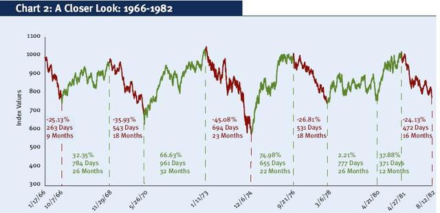
  1. The Dow fell 25% in 1966 after the yield curve inverted. The NBER declared a recession but later changed their mind and airbrushed it from their records.

Questions

1. Which is the most likely path for the Fed and RBA to follow: the High Road or the Low Road?

Answer: As Churchill once said: “You can always depend on the Americans to do the right thing. But only after they have tried everything else.” With rising inflation, the Fed is running out of options but they may still be tempted to kick the can down the road one last time. It seems like a 50/50 probability at present.

2. Comment on RBA housing?

We make no predictions but the rising ratio of housing assets to disposable income is cause for concern.

Australia & USA: Housing Assets/Disposable Income

3. Is Warren Buffett’s indicator still valid with rising offshore earnings of multinational corporations?

Answer: We plotted stock market capitalization against both GDP and GNP (which includes foreign earnings of US multinationals) and the differences are negligible.

Important recession warning

We have had a number of major indicators warning of a bear market over the year, with the S&P 500 falling by more than 20%, completing a Dow Theory reversal, and 100-day Momentum holding below zero.

S&P 500 Index

On the recession front, GDP recorded two quarters of negative growth — a useful rule of thumb recession measure. The middle of the Treasury yield curve also inverted — with the 10-year yield falling below the 2-year — warning of a recession ahead.

10-Year Treasury Yield minus 2-Year Treasury Yield

But unemployment (3.5%) is the lowest since the 1960s and the NBER has not moved to confirm a recession.

Unemployment

The front-end of the yield curve also remained positive, failing to confirm the signal from the 10-year/2-year negative spread.

Until now, that is.

On Tuesday, the 10-year/3-month Treasury spread turned negative, confirming the earlier 10Y/2Y recession warning.

10-Year Treasury Yield minus 3-Month Treasury Bill Discount Rate

Why is that important?

Because a negative 10-year/3-month spread has preceded every recession since 1960. One possible exception is 1966 (orange circle below). The 10Y/3M inverted, the Dow fell by 25%, and the NBER confirmed a recession but later changed their mind and airbrushed the recession out of the record. All-in-all, the 10Y/3M is our most reliable recession indicator, with a 100% track record in our view, over the past sixty years.

10-Year Treasury Yield minus 3-Month Treasury Bill Discount Rate

Conclusion

Our most reliable recession indicator, a negative 10-year/3-month Treasury yield differential, now confirms the recession warning from other indicators. But the signal is often early and it could take 6 to 12 months for the actual recession to arrive.

After their recent track record, expectations that the Fed will manufacture a soft landing are the triumph of hope over experience.

Employment is a lagging indicator and often only falls during the recession. Inflation likewise lags monetary policy by up to 6 months, before the full impact is clear. We expect the Fed to continue hiking, waiting for employment and inflation to fall, until the lagged impact of past rate hikes comes into view. Instead of cutting interest rates to soften the impact, the Fed has indicated they will hold rates high for longer. If so, we are likely to experience a severe recession.

Our strategy is to invest in cash in the short-term and limit exposure to equities, other than precious metals, critical materials, and defensive stocks.

Tech heavyweights pause for breath

Good progress has been made combating the pandemic but daily COVID cases seem to be struggling to break through a floor between 50 and 60 thousand. The vaccine roll-out is ahead of schedule but people need to stop listening to idiots like Rand Paul — who went to the Senate gym while infected — and listen to the Chief Medical Adviser whose advice is to wear a mask.

Daily US COVID Cases

Stocks have paused after the recent run up in Treasury yields. When both stocks and bonds are being sold, there is nowhere to hide.

The Nasdaq 100 is testing support at 12000. At this stage the correction looks mild, with declining Trend Index remaining above zero, but breach of 12000 would signal a test of the Sep 2020 low.

Nasdaq 100

The S&P 500 is performing better but Volatility troughs above 1.0% still warn of elevated risk.

S&P 500 & Twiggs Volatility 21-Day

The big five tech stocks are a mixed bag. Alphabet (GOOGL) and Facebook (FB) show strength. Microsft (MSFT) looks stable, while Mazon (AMZN) and Apple (AAPL) are trending lower.

AAPL, AMZN, GOOGL, FB, MSFT

When leaders no longer lead normally signals the final stage of a bull market. The chart below shows the Russell 2000 small caps ETF (IWM) clearly outperforming the large cap Nasdaq (QQQ) and S&P 500 (IVV) indices with all the tech heavyweights.

IVV, IWM, QQQ

@Schuldensuehner

The steeper yield curve benefits banks, who profit from the wider net interest margin. Major banks have climbed 60% to 80% over the past six months, with Goldman Sachs (GS) leading and Bank of America (BAC) the laggard.

Major Banks

Consumer durables sectors are, again, a mixed bag. Household Goods (HG) is flat, Apparel Retail (RA) is climbing steadily, while Automobiles (AU) is down sharply — mainly because of Tesla (TSLA).

Consumer Durables

Though light vehicle sales were down a million units in February.

Light Vehicle Sales

And heavy truck sales were down 4,000 units compared to January.

Heavy Truck Sales

Prospects for the tire industry are improving. Goodyear (GT) retraced to test its new support level after breaking out above its high from late 2019. Respect would confirm another advance.

Goodyear Tyre Co. (GT)

Conclusion

The recovery is going to be a long hard slog with frequent setbacks. Banks are doing nicely but stocks generally are over-priced and ripe for a major adjustment. There are signs that this is the final stage of the bull market and market risk is elevated.

US Stocks: Bull or Bear?

I have read several commentators proclaiming that the crisis is over and the stock market and US economy are back on track for solid growth. Let’s examine some of the evidence.

The Yield Curve (Bearish)

While the US yield curve has uninverted in the past and yet a recession has still come along, the uninversion seen in recent months coming after such a shallow and short-lived inversion provides confidence that the inversion seen last year gave a false signal…. (Shane Oliver at AMP)

Treasury 10 Year-3 Month Yield Differential

Yield curve inversions seldom last long. For one simple reason: the Fed fires up the printing press to reduce short-term interest rates and boost the economy. The yield curve uninverted before the last three recessions and this time looks no different.

Consumer Confidence (Bullish)

Retail sales kicked up in December, a sign of growing consumer confidence.

Retail excluding Auto

Auto sales are still flat but housing starts have also jumped.

Housing Starts & Permits

Economic Activity (Bearish)

When it comes to economic activity, Cass freight shipments are falling.

Cass Index

Rail freight indicators also point to declining activity levels.

Rail Freight

Employment (Neutral)

Leading employment indicators, such as temporary jobs and job openings, warn that labor market growth is slowing.

Temporary Jobs

Job Openings

But overall payroll growth, albeit subdued is still stable, with the 3-month TMO of non-farm payroll growth respecting the 0.5% amber warning level.

Payroll TMO

Valuations (Bearish)

Last week we compared market cap to profits before tax. This week, we compare to profits after tax. Recent levels above 20 have only previously been exceeded, in the past 60 years, during the Dotcom bubble.

Market Cap/Corporate Profits after Tax

Dallas Fed president Robert Kaplan conceded that expansion of the Fed balance sheet is helping to lift asset prices.

Commenting on the Fed’s massive liquidity response to the repo crisis, Kaplan said that “my own view is it’s having some effect on risk assets……It’s a derivative of QE when we buy bills and we inject more liquidity; it affects all risk assets. This is why I say growth in the balance sheet is not free. There is a cost to it. And we need to be very disciplined about it and sensitive to it.”

This is a clear warning to investors to stay on the defensive. We maintain our view that stocks are over-valued and will remain under-weight equities (over-weight cash) until normal earnings multiples are restored.

Warren Buffett is not infallible but the level of cash on Berkshire’s balance sheet seems to indicate a similar view regarding stock valuations.

Berkshire Hathaway Cash Holdings

A good time to be cautious

Markets are buoyant with the S&P 500 headed for another test of its all-time high at 2950. Bearish divergence on Twiggs Money Flow warns of secondary selling pressure but the overall technical outlook looks promising.

S&P 500

So why should it not be a good time to invest in stocks?

First, the yield curve warns of a recession in the next 6 to 18 months. The 10-year Treasury yield is below the yield on 3-month T-bills, indicating a negative yield curve. This is our most reliable recession signal, with 100% accuracy since the early 1960s.

Yield Differential

Annual jobs growth has declined since January. Further declines in the next few months would further strengthen the recession warning.

Annual Growth in Total Payrolls

Small cap stocks in the Russell 2000 lag well behind the S&P 500, indicating that investors are de-risking.

Russell 2000 ETF

Cyclical sectors like Automobiles & Components also offer an early warning, anticipating slower consumer spending on durables such as housing, clothing and automobiles.

S&P 500 Automobiles & Parts

Lastly, the historic Price-Earnings ratio is above 20 (PE and PEmax are equal at present), indicating stocks are over-priced.

S&P 500 historic PE ratio based on highest prior earnings

It’s a good time to be cautious.

Trade war reality sinks in

Realization that we are slipping into a trade war is starting to sink in.

The S&P 500 broke medium-term support at 2800, warning of a correction. The target is primary support at 2400. Volatility is flashing an amber warning, above 1.0%.

S&P 500

Nymex crude is plunging as anticipated global demand falls.

Crude Oil

Long-term Treasury yields are falling, with the 10-Year headed for a test of support at 2.0%. The Yield Differential (purple line) is back below zero, warning of a recession.

Yield Differential: 10-Year and 3-Month Treasuries

As I have mentioned earlier, a negative yield curve is a reliable early indicator of recession but trouble is imminent when it recovers above zero. Normally caused by the Fed cutting interest rates in response to falling employment growth. The critical indicator to watch is non-farm payroll growth. When that falls below 1.0% (right-hand scale), watch out!

Employment Growth and Fed Funds Rate

War is an evil thing; but to submit to the dictation of other states is worse…. Freedom, if we hold fast to it, will ultimately restore our losses, but submission will mean permanent loss of all that we value…. To you who call yourselves men of peace, I say: You are not safe unless you have men of action on your side.

~ Thucydides (circa 400 BC)

S&P 500: Treasuries warn of a bear market

10-Year Treasury yields plunged Friday, to close at 2.45%, warning of a decline to test primary support at 2.0%.

10-Year Treasury Yields

The yield curve is now likely to turn negative. The 10-Year/2-Year yield differential has already fallen to 0.13%. Below zero signals a negative yield curve, a reliable predictor of oncoming recession within the next 12 to 18 months.

10-Year minus 2-Year Treasury Yields

The S&P 500 retreated Friday and is likely to breach its new support level at 2800. Follow-through below 2600 would warn of a bear market.

S&P 500

Significant divergence

Market commentators are sifting through the data, looking for reasons to explain the sharp sell-off in stocks over the last two months. But everything they examine is likely to be shaded by their bear-tinted spectacles after the S&P 500 broke primary support at 2550.

S&P 500

The Nasdaq 100 also broke primary support, confirming the bear market.

Nasdaq 100

Of the big five tech stocks, Apple and Google are both testing primary support, threatening to follow Facebook into a primary down-trend. If the two break primary support, that would further strengthen the bear signal.

Big Five tech stocks

Volatility (21-day) is now close to 2% but the key is how volatility behaves on the next multi-week rally. If volatility forms a trough above 1% that would confirm the elevated risk.

S&P 500

Divergence? What Divergence?

Why do I say there is a significant divergence? Look at the fundamentals.

Fedex has just released stats for its most recent quarter, ended November 30. Package volumes are rising, not falling.

Fedex Stats

Supported by a very bullish Freight Transportation Index.

Freight Transportation Index

Consumption is strong, with Services and Non-durable goods rebounding. No sign of a recession here.

Consumption

Light vehicle sales are at a robust annual rate of 17.5 million.

Light Vehicle Sales

Retail sales growth (ex motor vehicles and parts) weakened in the last month but is still in an up-trend.

Retail

Housing starts and authorizations are still climbing.

Housing

Real construction spending (adjusted by CPI) is strong.

Construction

Manufacturers new orders (ex defense and aircraft) have rebounded after a weak 2015 – 2016.

Manufacturers New Orders

Corporate investment is growing at a faster rate than the economy, with rising new capital formation over GDP.

New Capital Formation

The Fed is shrinking its balance sheet which is expected to impact on liquidity. But commercial banks are running down excess reserves on deposit at the Fed at a faster rate, so that Fed assets net of excess reserves (green line) is actually rising. Hardly a drain on liquidity.

Fed Balance Sheet

Market pundits are watching the yield curve with bated breath, waiting for the 10-year to cross below the 2-year yield.

Yield Differential 10-Year minus 2-Year

In the past this has served as a reliable early warning, normally 12 to 24 months ahead of a recession. But the St Louis Fed Financial Stress Index is well below zero, signaling an accommodative financial environment.

Financial Stress Index

Why the mismatch? Fed actions — QE, Operation Twist, and even steps to shrink its balance sheet — have all suppressed long-term interest rates. We need to be wary of taking signals from a distorted yield curve.

Why have stocks reacted?

This is not a Pollyanna outlook. Never argue with the tape — we are clearly in a bear market. So why are stocks diverging from the economy?

The answer is China.

The impact of a trade war with the US would most likely cause a recession in China. Oil prices are already plunging in anticipation of falling demand.

Nymex Light Crude and Brent Crude

Commodities are likely to follow.

DJ UBS Commodities Index

The impact of a Chinese recession would be felt around the globe. Europe has its own problems and could easily follow.

DJ Europe Financial Index

The US is likely to emerge relatively unscathed but Wall Street is going to be exceedingly cautious until some semblance of normality is restored.

I do not suggest selling all your stocks but make sure that there is enough cash in the portfolio to take advantage of opportunities when they arise.