David Woo: Prelude to volatility

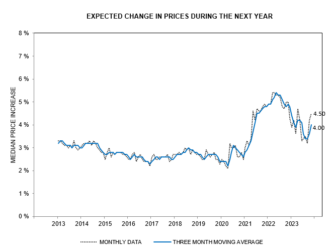
The bond market had a heart attack last week. Rising inflation caused a massive back up in bond yields in the short end of the market. The market is now pricing in two rate hikes in 2022. The Fed will have to raise real interest rates in order to tame inflation.

Real interest rates are falling. The stock market is taking its cue from the bond market and is rising. Stock prices represent discounted future cash flows, so negative real interest rates make a big difference to earnings multiples.

The Democrats are determined to spend their way to a mid-term election victory, with a $1T infrastructure bill and $1.75T social spending, both light on tax revenue. The GOP will try to stop them when the debt ceiling issue returns in December but they don’t have much leverage.

Financial conditions will have to tighten a lot more in 2022. The Fed is way behind the curve and is going to have to play catch-up.

Conclusion

Inflationary pressures in the US economy are growing, while the Democrats plan a further $2.75T in fiscal stimulus which is light on tax revenues.

Long-term yields lag far behind inflation, with real interest rates growing increasingly negative. The assumption is that the Fed will tighten sharply in 2022 to curb inflation. We expect that the Fed will taper but is not going to rush to hike interest rates for three reasons:

  1. The Fed would be tightening into a slowing economy, with growth fading as stimulus winds down;
  2. High energy prices will also help to cool demand; and
  3. US federal debt levels — already > 120% of GDP and likely to grow further with proposed new stimulus measures — are a greater long-term threat than inflation. The Fed and Treasury are expected to work together to boost GDP and tax revenues through inflation, keeping real interest rates negative to alleviate the cost to Treasury of servicing the excessive debt burden.

Deconstructing Evergrande’s effect on China

Elliot Clarke at Westpac says that China will be able to withstand the shock of Evergrande’s collapse and that power outages are a bigger threat.

We still think that the property sector contagion is part of a broader issue that China will struggle to overcome, as Michael Pettis succinctly explained:

China’s debt problem

Tweeted by Prof. Michael Pettis:

In the past — e.g. the SOE reforms of the 1990s, the banking crisis of the 2000s, SARS in 2003, the collapse of China’s trade surplus in 2009, COVID, etc. — whenever China faced a problem that threatened the pace of its economic growth, Beijing always responded by accelerating debt creation and pumping up property and infrastructure investment by enough to maintain targeted GDP growth rates. It didn’t adjust, in other words, but rather goosed growth by exacerbating the underlying imbalances.

That is why it had always been “successful” in seeing off a crisis. But when the main problem threatening further growth becomes soaring debt and the sheer amount of non-productive investment in property and infrastructure, it is obvious, or should be, that accelerating debt creation and pumping up property and infrastructure investment can no longer be a sustainable solution. All this can do is worsen the underlying imbalances and raise further the future cost of adjustment.

RBA tapers

From Bill Evans at Westpac:

The Governor of the Reserve Bank has announced the intention to reduce the weekly purchases from $5 billion to $4 billion and not to extend its Yield Curve Target from the April 2024 bonds to the November 2024 bonds – two clear signs that policy is tightening…..

The decision to not extend the Yield Curve Target program to the November 2024 bonds….Giving up the option to extend the purchases at 0.1% to a 3 year 4 month bond from a 2 year 9 month bond, is effectively tightening policy.

Deflationistas and base effects

Deflationistas like respected economist David Rosenberg point to a sharp decline in bank credit over the past 12 months as evidence of deflation.

By the end of April, commercial bank loans and leases had declined by $510 billion, or 4.7% of total, over the past 12 months.

Commercial Banks: Loans & Leases

That would be cause for concern but it does not take into account the massive $742 billion surge in lending in the preceding two months, March-April 2020, when borrowers drew on lines of credit to ensure that they had sufficient liquidity during the pandemic. They were afraid that banks would withdraw credit facilities in anticipation of widespread corporate defaults.

Commercial Banks: Loans & Leases

Conclusion

There is no credit contraction.

Bank credit did shrink by $510 billion in the past 12 months but this followed an unusual $742 billion surge in credit as borrowers drew on credit facilities to ensure liquidity during the first two months of the pandemic. What we have witnessed is the normalization of bank credit, with borrowers repaying credit temporarily drawn at the height of the liquidity crunch.

We expect normal credit growth to resume.

Gold breaks $1850 per ounce

10-Year Treasury yields remain soft despite the recent CPI spike. The Fed is weighting purchases more to the long end of the yield curve. Breakout above 1.75% (green line) would signal a fresh advance.

10-Year Treasury Yield

10-Year TIPS yield sits at -0.78%, unaffected by the $369bn in overnight Fed reverse repurchase agreements which remove liquidity but mainly affect short-term interest rates.

10-Year TIPS Yield & Fed RRP

Gold broke through resistance at $1850/ounce. A rising Trend Index indicates medium-term buying pressure. Long tails on the last three daily candles indicate retracement to test the new support level; respect signals a test of $1950/ounce.

Spot Gold

Silver is testing resistance at $28/ounce. Rising Trend Index indicates medium-term buying pressure. Breakout above $28 is likely and would offer a target of $30/ounce in the short/medium-term.

Spot Silver

The Dollar index is testing primary support between 89 and 90. Rising Trend Index (below zero) suggests another test of the descending trendline. Respect is likely and breach of primary support would offer a medium/long-term target of 851.
Dollar Index

From Luke Gromen at FFTT:

When you are an externally-financed twin deficit nation with insufficient external funding (as Druckenmiller pointed out), there are three potential release valves:

  1. Higher unemployment.
  2. Higher interest rates.
  3. Lower currency (inflation.)

With US debt/GDP at 130%, Options #1 and #2 aren’t an option……

Conclusion

We expect long-term Treasury yields to remain low while inflation rises, causing the US Dollar to sink and Gold and Silver to advance.

Our long-term target for Gold of $3,000 per troy ounce2.

Notes

  1. Dollar Index (DXY) target of 85 is calculated as the peak of 93 extended below support at 89.
  2. Gold LT target calculation: base price of $1840/ounce + [TIPS yield of -0.87% – (nominal Treasury yield of 1.64% – real inflation rate of 5.30%)] * $400/ounce = $2956/ounce

ASX Technology stocks fall

The ASX 200 continues to test its February 2020 high at 7200. Narrow consolidation below resistance is a bullish sign but we need to keep a weather eye on the US and China.

ASX 200

Financial Markets

Bond ETFs, in a sideways consolidation, indicate that long-term interest rates are holding steady. Inflation remains muted and the RBA is following through on their stated intention to suppress long-term yields.

Australian Bond ETFs

A-REITs are testing resistance at 1500. Reversal below 1340 is unlikely but would warn of a double-top reversal.

ASX 200 REITs

Financials are testing resistance at 6500. A rising 13-week Trend Index — with troughs above zero — flags buying pressure, suggesting that a breakout is likely.

ASX 200 Financials

Health Care, Discretionary & Technology

Health Care is testing resistance at 42500. The rising Trend Index is bullish but failure to cross above zero would confirm long-term selling pressure. Breach of 40000 would complete a bull-trap (a bear signal for investors) and warn of another test of primary support at 37500.

ASX 200 Health Care

Technology broke support at 1900 to signal a primary down-trend, imitating the pattern in US markets. Breach offers a medium-term target of 14001.

ASX 200 IT

Consumer Discretionary is testing its rising trendline. We expect a test of support at 2900 as the impact of government stimulus fades.

ASX 200 Discretionary

Mining

Iron ore retreated slightly, to $210/metric ton. Chinese steel mills are stockpiling — due to rising tensions with Australia and anticipated production curbs in China (to reduce pollution levels). The boom is only expected to last as long as stockpiling continues. Then prices are likely to fall steeply as mills run down stockpiles. Reversal below support at $175-$180 would warn of a sharp decline.

Iron Ore

The ASX 300 Metals & Mining found resistance at 6000. A tall shadow on this week’s candle warns of short-term selling pressure. Another test of support at 5000 is likely.

ASX 300 Metals & Mining

The All Ordinaries Gold Index (XGD) continues to test its new support level at 7000. Follow-through below recent lows would warn of another test of 6000, while recovery above 7300 would signal a fresh advance. Breakout above the long-term descending trendline would strengthen the bull signal. Gold bullishness is fueled by rising inflation fears.

All Ordinaries Gold Index

The Gold price, in Australian Dollars, is testing its descending trendline and resistance at 2400. Breakout above the two would deliver a strong bull signal.

Gold in AUD

Conclusion

Technology stocks have commenced a primary down-trend. Metals & Mining look highly-priced and susceptible to a sharp reversal. They have looked that way for months but sooner or later we are bound to see a rapid re-pricing.

Steady long-term interest rates and a buoyant housing market are lifting REITs and Financials respectively. Health Care and Consumer Discretionary look hesitant, while Gold stocks are making a tentative rally.

Notes

  1. Target for XIJ is its 2400 peak extended below 1900.

Gold and Copper: Towards a new measuring stick

Our old measuring stick, the Dollar, is broken and no longer fit-for-purpose. The Fed and other major central banks have consistently eroded the value of their national currencies through quantitative easing; expanding their balance sheets by 580% — from $5T to $29T — over the past 14 years, as the chart from Ed Yardeni below shows.

Total Assets of Major Central Banks

Currency debasement is easily hidden from view by simultaneous policies across central banks, affecting all major currencies.

Gold as a benchmark

Attempts to use Gold as an independent benchmark are frequently interfered with by government attempts to suppress the Gold price, dating back to the London Gold Pool of the early 1960s. Alan Greenspan even went so far as to base Fed monetary policy on Gold, not so much to suppress the Gold price but as an early warning of inflation (measured inflation figures are lagged and therefore useless in setting proactive monetary policy). The result was similar, however, suppressing fluctuations in the Gold price.

A new benchmark

Earlier than Greenspan, Paul Volcker had used a benchmark based on a whole basket of commodities to measure inflation.

Our goal is derive a similar but simpler benchmark that can be applied to measure performance across a wide range of asset classes.

Copper and other industrial metals, on their own, are not a viable alternative because demand tends to fluctuate with the global economic cycle.

Gold and Silver also tend to fluctuate but their cyclical fluctuations, especially Gold, tend to run counter to industrial metals. Demand for Gold is driven by safe haven demand which tends to be highest when the global economy contracts.

We therefore selected Gold and Copper as the two components of our benchmark because their fluctuations tend to offset each other, providing a smoother and more reliable measure. A mix of 5 troy ounces of Gold and 1 metric ton of Copper provides a fairly even long-term balance between the two components as illustrated by the chart below. The middle line is our new benchmark.

5 Troy Ounces of Gold & 1 Metric Ton of Copper

Copper (red) leads in times of inflation, when industrial demand is expanding rapidly, while Gold (yellow) leads in times of deflation, when the global economy contracts.

First, let’s address the weaknesses. China’s entry to the World Trade Organization (WTO) in the early 2000s, a once-in-a-century event, caused a surge in the price of both Copper and Gold. The change drove up commodity prices but drove down prices of finished goods; so we are undecided whether this is truly inflationary.

The sharp fall in 2008, however, is accurately depicted as a massive deflationary shock, caused by private debt deleveraging during the global financial crisis (GFC). Central banks then intervened with balance sheet expansion (QE). Accompanied by fiscal stimulus, QE caused a huge inflationary spike lasting from 2009 to 2011.

5 Troy Ounces of Gold & 1 Metric Ton of Copper

Fed expansion paused in 2011-2012 and was followed by a sharp contraction by the European Central Bank (ECB), causing deflation, as the breakdown from Ed Yardeni below shows. The ECB then reversed course — following Mario Draghi’s now famous “whatever it takes” — and, accompanied by the Bank of Japan (BOJ), engaged in another rapid expansion.

Total Assets of Major Central Banks

The Fed attempted to unwind their balance sheet in 2018-19, causing a brief deflationary episode before all hell broke loose in September 2019 with the repo crisis. Fed balance sheet expansion in late 2019 was, however, dwarfed by the expansion across all major central banks during the pandemic. Fed QE caused a sharp spike in the M2 money supply as well as in our Gold-Copper index (GCI), warning of strong inflation.

GCI & M2 Money Stock

Market Values using our GCI benchmark

While not as high as some valuation measures (PE or Market Cap/GDP), plotting the Wilshire 5000 Total Market Index against the GCI shows stocks trading at levels only exceeded during the 1999-2000 Dotcom bubble.

Wilshire 5000 Total Market Index/GCI

The Case-Shiller Index plotted against GCI shows home prices are relatively low in real terms, most of the froth being created by a shrinking Dollar.

Case Shiller US National House Price Index/GCI

But if you think housing is cheap — after the China-shock — look what happened to wages.

Average Hourly Manufacturing Earnings/GCI

Precious Metals

Plotting Gold against the GCI might seem counter-intuitive but it highlights, quite effectively, periods when Gold is highly-priced relative to its historic norm. The yellow metal retreated to within its normal trading range in March 2021.

Gold/GCI

The plot against GCI offers far less distortion than the Gold-Oil ratio below.

Gold/Brent Crude

We only have 4 years of data for Silver (on FRED). Plotting against GCI warns that silver is highly-priced at present but we will need to source more data before drawing any conclusions.

Silver/GCI

Conclusion

Stock prices are high and overdue for a major correction but this is only likely to occur when: (a) government stimulus slows; and/or (b) the Fed tapers its Treasury purchases, allowing long-term Treasury yields to rise. Market indications — and dissenting voices (Robert Kaplan) at the Fed — suggest that the taper could occur sooner than Jay Powell would have us believe.

The Gold-Copper index (GCI) warns of strong inflation ahead, which should be good for both commodities and precious metals. But bad for stocks and bonds.

This time is different

The chart below compares the Wilshire 5000 broad market index (light blue) to the money supply (MZM or “at call” money). The previous two recessions show a surge in the money supply (green circles) as the Fed injects liquidity into financial markets to forestall a deflationary spiral. In both cases, stocks took more than two years to react, with the low-point reached 8 quarters after the Fed started to inject liquidity in Q1 2001 and 9 quarters after liquidity injections commenced in Q3 of 2007.

MZM Money Supply and Wilshire 5000

It took almost 13 years for the index to make a new high after its Q1 2001 Dotcom peak and 5.5 years after its Q3 2007 peak (values are plotted relative to GDP).

The recovery in 2020 was quite different. The index formed a low two quarters after the Fed started to inject liquidity and had recovered to a new high in the next quarter.

While the recovery from the Dotcom crash took an unusually long time — because of the extreme valuations — we can still conclude that the latest recovery was exceptional. Record government stimulus caused a surge in disposable incomes, rather than the fall seen in previous recessions.

Disposable Personal Income

The surge in disposable income combined with a sharp fall in consumption caused a massive spike in personal saving, much of which flowed into the stock market.

Personal Saving

Huge inflows caused a surge in stock prices, which in turn led to similar exuberance to the Dotcom bubble of 1999-2000.

“This is the only time in my 88 years when I saw technology stocks go to 100 times earnings; or, when there were no earnings, 20 times sales. It was insane, and I took advantage of the temporary insanity.” ~ Sir John Templeton, in 2001.

Conclusion

While the government attempt to prevent a fall in personal disposable income during the pandemic is laudable, their overreaction caused a massive spike in personal saving — spreading the contagion to the stock market. Stocks are now trading at precarious levels relative to earnings, with no easy way for authorities to engineer a soft landing.

We are not sure how long the Fed can prop up the stock market but are certain that it will end badly for investors who ignore the risks.

Notes

Sir John Templeton (1912-2008) was an American-born contrarian and value investor, banker, fund manager, and philanthropist. He founded the Templeton Growth Fund in 1954, which averaged more than 15% p.a. over 38 years. In 1999, Money magazine rated him as “arguably the best stock picker of the century.”

Inflation is baked into the cake

Inflation is a hot topic at the moment. For good reason: higher inflation would drive up interest rates, affecting both bond and equity prices, as well as commodities and precious metals.

March CPI jumped to 2.64% but the increase is partly attributable to the low base from March 2020. Core CPI (excluding food and energy) came in at a more modest 1.65%. The main difference between CPI and core CPI is rising energy and food costs.

CPI & Core CPI

The annual inflation rate in the US ……is the highest reading since August of 2018 with main upward pressure coming from energy (13.2% vs 3.7% in February), namely gasoline (22.5% vs 1.6%), electricity (2.5% vs 2.3%) and utility gas service (9.8% vs 6.7%). Prices also accelerated for used cars and trucks (9.4% vs 9.3%), shelter (1.7% vs 1.5%) and new vehicles (1.5% vs 1.2%) while inflation slowed for medical care services (2.7% vs 3%) and food (3.5% vs 3.6%). Cost of apparel continued to fall (-2.5% vs -3.6%)……..a jump in commodities and material costs, coupled with supply constraints, are pushing producer prices up and some companies are passing those costs to clients. (Reuters)

10-year Treasury yields eased to 1.62% with the breakeven inflation rate at 2.33% — weakening the real 10-year yield to -0.71%.

10-Year Treasury Yield & Breakeven Inflation Rate

Inflation and the Money Supply

Milton Friedman famously said, “Inflation is always and everywhere a monetary phenomenon in the sense that it is and can be produced only by a more rapid increase in the quantity of money than in output.”

CPI & M2 Money Supply

But experience since the 1980s shows several surges in money supply growth without a corresponding rise in inflation. While an increase in money supply may be a prerequisite for a spike in inflation, it is not the cause.

More direct causes of inflation are increases in input costs for suppliers of goods and services. The two largest input costs are commodities and wages. Rises in commodity prices will mostly affect the manufacturing sector, while increases in wage rates impacts on all employers. Also, commodity prices tend to be cyclical, so price fluctuations will be more readily absorbed, while wage increases tend to be permanent and more likely to be passed on to customers.

The chart below shows a much closer correlation between hourly wage rates and CPI since the 1970s, with surges in hourly earnings accompanied by a rise in inflation.

CPI & Hourly Manufacturing Wages

Conclusion

Rising commodity prices are driving higher inflation at present. While some of the pressures may be transitory, due to supply interruptions, underinvestment in new production over the last decade is likely to act as a supply constraint for both energy and base metals. Rising demand fueled by short-term stimulus and longer-term infrastructure investment would act as an accelerant.

Wage rate increases are so far restrained, but that is likely to change as the economy recovers, boosted by decoupling from China and on-shoring of critical supply chains. Shortages of skilled labor are expected to drive up wage rates, maintaining upward pressure on inflation in the longer-term. Training and education of suitable staff will take time.

We have all the ingredients for an inflation spike. A massive boost in the money supply, accompanied by record stimulus payments, much of which has been channeled into savings. This will help to fuel increased demand in the longer term, while restricted supply will drive up commodity prices and wage rates for skilled labor.