This is our last newsletter for the year, where we take the opportunity to map out what we see as the major risks and opportunities facing investors in the year ahead.
US Economy
The Fed has been hiking interest rates since March this year, but real retail sales remain well above their pre-pandemic trend (dotted line below) and show no signs of slowing.

Retail sales are even rising strongly against disposable personal income, with consumers running up credit and digging into savings.

The Fed wants to reduce demand in order to reduce inflationary pressure on consumer prices but consumers continue to spend. Household net worth has soared — from massive expansion of home and stock prices, fueled by cheap debt, and growing savings boosted by government stimulus during the pandemic. The ratio of household net worth to disposable personal income has climbed more than 40% since the global financial crisis — from 5.5 to 7.7.

At the same time, unemployment (3.7%) has fallen close to record lows, increasing inflationary pressures as employers compete for scarce labor.

Real Growth
Hours worked contracted by an estimated 0.12% in November (-1.44% annualized).

But annual growth rates for real GDP growth (1.9%) and hours worked (2.1%) remain positive.

Heavy truck sales are also a solid 40,700 units per month (seasonally adjusted). Truck sales normally contract ahead of recessions, marked by light gray bars below, providing a reliable indicator of economic growth. Sales below 35,000 units per month would be bearish.

Inflation & Interest Rates
The underlying reason for the economy’s resilience is the massive expansion in the money supply (M2 excluding time deposits) relative to GDP, after the 2008 global financial crisis, doubling from earlier highs at 0.4 to the current ratio of 0.84. Excessive liquidity helped to suppress interest rates and balloon asset prices, with too much money chasing scarce investment opportunities. In the hunt for yield, investors became blind to risk.

Suppression of interest rates caused the yield on lowest investment grade corporate bonds (Baa) to decline below CPI. A dangerous precedent, last witnessed in the 1970s, negative real rates led to a massive spike in inflation. Former Fed Chairman, Paul Volcker, had to hike the Fed funds rate above 19.0%, crashing the economy, in order to tame inflation.

The current Fed chair, Jerome Powell, is doing his best to imitate Volcker, hiking rates steeply after a late start. Treasury yields have inverted, with the 1-year yield (4.65%) above the 2-year (4.23%), reflecting bond market expectations that the Fed will soon be forced to cut rates.

A negative yield curve, indicated by the 10-year/3-month spread below zero, warns that the US economy will go into recession in 2023. Our most reliable indicator, the yield spread has inverted (red rings below) before every recession declared by the NBER since 1960*.

Bear in mind that the yield curve normally inverts 6 to 18 months ahead of a recession and recovers shortly before the recession starts, when the Fed cuts interest rates.
Home Prices
Mortgage rates jumped steeply as the Fed hiked rates and started to withdraw liquidity from financial markets. The sharp rise signals the end of the 40-year bull market fueled by cheap debt. Rising inflation has put the Fed on notice that the honeymoon is over. Deflationary pressures from globalization can no longer be relied on to offset inflationary pressures from expansionary monetary policy.

Home prices have started to decline but have a long way to fall to their 2006 peak (of 184.6) that preceded the global financial crisis.

Stocks
The S&P 500 is edging lower, with negative 100-day Momentum signaling a bear market, but there is little sign of panic, with frequent rallies testing the descending trendline.

Bond market expectations of an early pivot has kept long-term yields low and supported stock prices. 10-Year Treasury yields at 3.44% are almost 100 basis points below the Fed funds target range of 4.25% to 4.50%. Gradual withdrawals of liquidity (QT) by the Fed have so far failed to dent bond market optimism.

Treasuries & the Bond Market
Declining GDP is expected to shrink tax receipts, while interest servicing costs on existing fiscal debt are rising, causing the federal deficit to balloon to between $2.5 and $5.0 trillion according to macro/bond specialist Luke Gromen.

With foreign demand for Treasuries shrinking, and the Fed running down its balance sheet, the only remaining market for Treasuries is commercial banks and the private sector. Strong Treasury issuance is likely to increase upward pressure on yields, to attract investors. The inflow into bonds is likely to be funded by an outflow from stocks, accelerating their decline.
Energy
Brent crude prices fell below $80 per barrel, despite slowing releases from the US strategic petroleum reserve (SPR). Demand remains soft despite China’s relaxation of their zero-COVID policy — which some expected to accelerate their economic recovery.

European natural gas inventories are near full, causing a sharp fall in prices. But prices remain high compared to their long-term average, fueling inflation and an economic contraction.

Europe
European GDP growth is slowing, while inflation has soared, causing negative real GDP growth and a likely recession.

Australia, Base Metals & Iron Ore
Base metals rallied on optimism over China’s reopening from lockdowns. Normally a bullish sign for the global economy, breakout above resistance at 175 was short-lived, warning of a bull trap.

Iron ore posted a similar rally, from $80 to $110 per tonne, but is also likely to retreat.

The ASX benefited from the China rally, with the ASX 200 breaking resistance at 7100 to complete a double-bottom reversal. Now the index is retracing to test its new support level. Breach of 7000 would warn of another test of primary support at 6400.
China
Optimism over China’s reopening may be premature. Residential property prices continue to fall.

The reopening also risks a massive COVID exit-wave, against an under-prepared population, when restrictions are relaxed.
“In my memory, I have never seen such a challenge to the Chinese health-care system,” Xi Chen, a Yale University global health researcher, told National Public Radio in America this week. With less than four intensive care beds for every 100,000 people and millions of unvaccinated or partially protected older adults, the risks are real.
With official data highly unreliable, it is hard to track exactly what impact China’s U-turn is having. Authorities on Friday reported the first Covid-19 deaths since most restrictions were lifted in early December, but there have been reports that funeral homes in Beijing are struggling to handle the number of bodies being brought in.
“The risk factors are there: eight million people are essentially not vaccinated,” said Huang Yanzhong, senior fellow for global health at the Council on Foreign Relations.
“Unless this variant has evolved in a way that makes it harmless, China can’t avoid what happened in Taiwan or in Hong Kong,” he added, referring to significant “exit waves” in both places.
The scale of the surge is unlikely to be apparent for months, but modelling suggests it could be grim. A report from the University of Hong Kong released on Thursday warned that a best case scenario is 700,000 fatalities – forecasts from a UK-based analytics firm put deaths at between 1.3 and 2.1 million.
“We’re still at a very early stage in this particular exit wave,” said Prof Ben Cowling, an epidemiologist at the University of Hong Kong. (The Telegraph)
China relied on infrastructure spending to get them out of past economic contractions but debt levels are now too high for stimulus on a similar scale to 2008. Expansion of credit to local government and real estate developers is likely to cause further stagnation, with the rise of zombie banking and real estate sectors — as Japan experienced for more than three decades — suffocating future growth.

Conclusion
Resilient consumer spending, high household net worth, and a tight labor market all make the Fed’s job difficult. If the current trend continues, the Fed will be forced to hike interest rates higher than the bond market expects, in order to curb demand and tame inflation.
Expected contraction of European and Chinese economies, combined with rate hikes in the US, are likely to cause a global recession.
There are two possible exits. First, if central banks stick to their guns and hold interest rates higher for longer, a major and extended economic contraction is almost inevitable. While inflation may be tamed, the global economy is likely to take years to recover.
The second option is for central banks to raise inflation targets and suppress long-term interest rates in order to create a soft landing. High inflation and negative real interest rates may prolong the period of low growth but negative real rates would rescue the G7 from precarious debt levels that have ensnared them over the past decade. A similar strategy was successfully employed after WWII to extricate governments from high debt levels relative to GDP.
As to which option will be chosen is a matter of political will. The easier second option is therefore more likely, as politicians tend to follow the line of least resistance.
We have refrained from weighing in on the likely outcome of the Russia-Ukraine conflict. Ukraine presently has the upper hand but the conflict is a wild card that could cause a spike in energy prices if it escalates or a positive boost to the European economy in the unlikely event that peace breaks out.
Our strategy is to remain overweight in gold, critical materials, defensive stocks and cash, while underweight bonds and high-multiple technology stocks. In the longer term, we will seek to invest cash in real assets when the opportunity presents itself.
Acknowledgements
- Hat tip to Macrobusiness for the Pantheon Macroeconomics (China Residential) and Goldman Sachs (China Local Government Funding & Excavator Hours) charts.
Notes
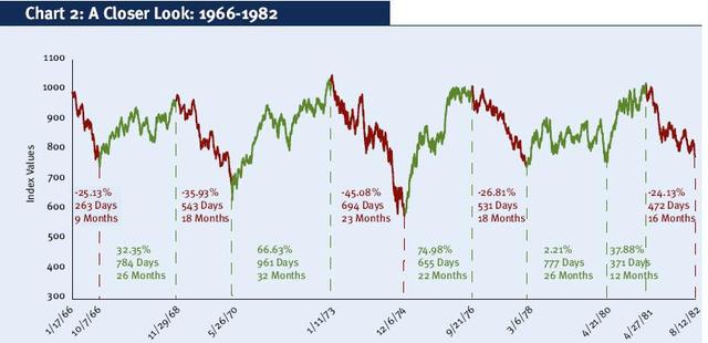
* The yield curve inverted ahead of a 25% fall in the Dow in 1966. The NBER declared a recession but later changed their minds and airbrushed it out of their records.
Colin Twiggs is a former investment banker with almost 40 years of experience in financial markets. He co-founded Incredible Charts and writes the popular Trading Diary and Patient Investor newsletters.
Using a top-down approach, Colin identifies key macro trends in the global economy before evaluating selected opportunities using a combination of fundamental and technical analysis.
Focusing on interest rates and financial market liquidity as primary drivers of the economic cycle, he warned of the 2008/2009 and 2020 bear markets well ahead of actual events.
He founded PVT Capital (AFSL No. 546090) in May 2023, which offers investment strategy and advice to wholesale clients.


